“Most of the important things in the world have been accomplished by people who have kept on trying when there seemed to be no hope at all.” -Dale Carnegie I suppose right about now “hope” is probably the most important thing for me to have as I face the waiting game along with the many […]
Category Archives: Updates
this is the logo i voted for!!
phew…I’m definitely worried how many who voted might be disappointed. Glad to see you know me well enough to know that that logo definitely matches me better! :o)
“The ultimate measure of a man is not where he stands in moments of comfort and convenience, but where he stands at times of challenge and controversy.” -Martin Luther King Jr. Today would have been my “follow up” visit for the first D&C if everything had gone as planned. Unfortunately, instead it was one of […]
by Amanda Kern
4 comments
Erica, Mike, Isa & Lili
:o) =o)
well im glad you update us with everything and anyone who feels my sister is sharing too much can jump off acliff! i love you guys still praying for ya too!
ditto to that, joleen. transparency is very helpful at times like these for those of us that care and worry. it takes a great deal of courage to share and be so open with issues so traumatic and personal. dr. volker gallichio says hang in there and make sure you get some rest amanda!
thanks guys. It’s definitely been tough to rest this mind of mine until more time passes. That said on just 2 1/2 hours of sleep between being in discomfort still from the effects of surgery and just having my mind unsettled about all the recent news. :o( They say pain is weakness leaving the body…so give me a bit more time and I’ll seriously be tough as nails guys. I don’t see how I can have much more weakness inside me after all I’ve been through these last few weeks.
I’m excited to finally share the preliminary concepts for the logo for my photography business. Though I’m also a designer myself, I elected to step back from the design process to give one of my former students, award-winning designer, Daissy Linares, an opportunity to come up with a few concepts that would represent me and […]
by Amanda Kern
29 comments
I like concept #1 for its simplicity and fun nature, however concept #4 feels better with the style of photography you specialize in. Its a bit more mature. Careful with concept #3, its easily mistaken for someone flipping the bird. (No offense duende)
Out of the choices 4th looks the most appropriate. Number 1 looks the strongest for a logo overall but it doesnt really speak photography.
Honestly I enjoy the logo you currently have for your header though its a bit played out with the signature mark. It’s classy and speaks photography.
I would enjoy seeing concept 4 further expanded possibly having the logo mark towards the left and the right using ur name and photography. Showing it more of a horizontal fashion would fit best on your website header.
Can’t wait to see the overall outcome
Efrain
What r you talking about Steve? That would be great if everyone mistook that for flipping the bird, cuz then Amanda can say its playful reference to the old photography term used for getting children to smile in photos: “Smile for the Birdie”
Actually, I feel that Steve makes a good point. Concept #1 lends itself too much to one style or age. Be weary of that if you are trying to avoid it. Concept one is very young, and although you shoot a great deal of newborn photography who knows how the logo will interpreted by the parents seeking the photographer.
Concept #5 is very mature and very refined and still very unique, but could be mistaken for a misregistration issue when being printed. But i absolutely love the type treatment. I would buy that t-shirt when it gets printed.
Overall, I like concept #4. It is very iconic, and even very conceptual. The pre bloom flower bud relates to your target subjects. It also feels like the flower is the subject of a photo itself, and its being photographed in the bottom right quadrant of the frame.
That’s just my opinion. Take it with a grain a salt.
that was fun! thanks for letting us vote!
Very interesting vote results thus far.
oh! and sorry amanda i can’t resist: concepts 1 – 3 remind me of the ameriking project we had in advanced 2 years ago.
Your name – all by itself- carries so much weight, so much integrity and reputation. I feel like the everything else takes away from that. That’s why I voted Concept #5. Even tho that’s too swirly for my taste. Just sayin’.
ohhh looks like i picked the one majority has picked. i really feel like #4 is more amanda’s style. and its got a clean modern feel… and the concept is more suitable for photography. good job though, theyre all great concepts!
I liked #4 I fits your personality better, nice and soft. Like all the baby photos I see you post
#4 for me. Looks enough but not quite like a lens diaphragm. Decisions… decisions
Hey Amanda. Hope everything is going well with you.
I’m going with #5. I like the simplicity of #1 but there is a bit of awkward negative space in the a, that bugs me a little, #2 leaves me unsure if thats a flame at the terminal of the k or some type of bloom. #3 reminds me of the too prevalent leafy sprouty trend that’s been going around. I think #4 and #5 are both very classic and say photography. The illustration in #4 is very tactile and has a great line quality to it. However #5 wins for me because the typography is beautiful, its got a great flow to it and both clean and sophisticated. A classy logo for a classy lady.
First of all, who is that beautiful baby when you first come to the site? Father must have some rockin guns ;^) Anyway. Good eye Steve (as always). As one who’s been through the Amanda Kern Photography experience, the fifth concept feels right. I think it compliments the style well. When I first saw the edited photos of Abigail, my thoughts were set in the type face used for #5.
Ah! also #4 reminds me of Hallmark.
woo! concept 4 is in the lead, it’s the one that makes you stop and look, that’s the goal!
Hola! Love them all.. everyone makes good points, but I think has skipped over this statement in your explanation:
“During the design process we discussed the importance of the versatility of my logo to represent not just my photography, but other endeavors I am equally involved in such as education and design.”
1&2 do have a younger edge to them, so in having to vote for only one I skipped them.
4 is very, very nice… but it’s too classy and refined for someone who is working so hard and wants to make their mark. Number 4 speaks ‘photography’ yes… but you may lose the versatility you’re looking for and blend in with the hundreds of other photographers out there.
5 is a close second in my choice and I would love to see it stay as is or be explored a little more. It’s elegant, slightly feminine and has a solid polished feel. This logo would say ‘established professional’ the second it’s implemented.
3 wins my vote for being fresh and refined at the same time. It can be flexible while staying a little edgy. It’s the most transitional to a graphical icon without dropping your initials because the initials are the graphic. It will also double as a great watermark. It makes a great die cut in multiple situations. Both Steve and Hachem’s woes can be avoided with small tweaks. The sans-serif style feels up with the times and we all know how you strive to be current and up-to-date. I could go on, but that’s the just of it. Good Luck!!
ps.. I organized my whole comment into nice clear lines with breaks and once submitted it eliminated all the breaks
Sorry Kenny…I sure hope to look into the comment formatting of my blog soon, this blog is still rather “new”. And I am very intrigued by the outcome of this survey. Though I certainly like #4 it definitely was NOT the one I had considered as my top two choices. And Ed, you crack me up…glad to hear that beautiful 9lb baby of yours let you show off those guns!!! :o)
Amanda, they are all GREAT!!! I personally like one best because it just looks professional, but I agree that number four fits your personality best!! Love and miss you all even if I am in Korea!!!
To help on my decision, I kept in mind about your target audience as well. I know you do a lot of newborn, therefore most people who seek for your photography services would be parents. With that in mind, I chose #4 because I feel that it represents you and your photography best. The classiness and elegance reflects your photography. The clean and solid design reflects your personality and as a designer. I especially like the flower/rose inside the box, because it acts like a photo. It has this delicate yet professional look to it. To me this logo says, professional photographer-designer who is attentive to details captures life’s delicate beauty.
Number #4 really??? I’m still very surprised by everyone’s opinions.
Concept #4 also slightly resembles an iris of a camera.
#4 (among other things) looks like a polaroid with a photo of a wrapped up baby in it. lol!
I love all of them but specially Numero 4 because it represent a more classic and simplistic style just as your photography. I would suggest working a bit more on the word photography and the dots, I’m not really into the dots. But you can probably make them even smaller and separate them a bit more. awesome work!
Number 4, Number 4, Number 4!!!
My logo must represent me as a person…not just as a photographer…remember this should represent me as a designer, educator, etc. – not just photography. So as much as I love everyone’s visual cues with #4 relating to photos and babies…that’s not the only thing I do. I’m still very shocked at the results thus far…
I think #5 reflects more what you are, it is clean, slick, detail oriented and sophisticated, also is a reflection of the elegance of your photography. My 2 cents.
Amanda,
I love your blog. As for the designs, I was torn between 1 & 3. I finally chose 1 because it is crisp and clear in presenting you. I thought 3 was a little more feminine but I went with the clarity of 1. I really liked 4 also…and 5. Obviously, you can’t go wrong. They are wonderful designs. Congrats on your new business. Hope you had a nice birthday and anniversary. Much love to you, hon.
Connie
I’m a little crossed between #1 & 5. I like #1 for the bubbly and fun style, but it doesn’t say photography to me. #5 I like for its simplicity and it’s elegance, but I’m not feeling the drop shadow effect. But with that being said, but feel more complete to me than any of the others
I love the simple design of the first concept, but love concept 4 for the imagery.
life is a gift… and it offers us the privilege, opportunity, and responsibility to give something back by becoming more. – anthony robbins With as much as I try to do the last few years, I find myself being told I should try to stop doing so much. Yes, I’m the one that typically says […]
by Amanda Kern
64 comments
I just ended up on your web site. I work for a wine distributor in Nashville Tn and as you might imagine… i have a lot of corks. Is the “Save the cork” cause still valid? If so, I would like to send you some corks.
Viviana we are doing save the corks still through the new year!
in Österreich
245 ???????? ?????? ?????? ??????
??????????? ???? ????????? 16 ?????? ????????? ????? ?? ?????? ? ?????????? ??????? ???????? ??????
del farmaci in Svizzera
certainly donate to this outstanding blog!
I suppose for now i’ll settle for book-marking and adding your RSS feed to my Google account.
I look forward to new updates and will talk
about this blog with my Facebook group. Talk soon!
medicijnen: effectieve pijnverlichting zonder gedoe
precios de medicamentos Combix Repelón ¿Cuáles son los beneficios de comprar medicamentos en línea?
I am in fact enjoying by these.
things from it regarding blogging. thanks.
almus Poza Rica médicaments en vente avec des instructions d’utilisation claires
Wetzikon farmaci consigliati dai medici
Heelsum online aankoop van medicijnen in Parijs
here at this website, thanks admin of this web page.
medicamentos fácilmente accesible pfizer Ajaccio scopri i prezzi di farmaci a Bruxelles, Belgio
von Medikamenten
site? Its very well written; I love what youve
got to say. But maybe you could a little more in the
way of content so people could connect with it
better. Youve got an awful lot of text for only having
1 or 2 pictures. Maybe you could space it out better?
beschikbaarheid van medicijnen in Rotterdam Angenerico Salta acquisto di farmaci in Europa
Vetere medicamentos para comprar sin problemas
articles. I’ll bookmark your weblog and check again here regularly.
I am quite sure I’ll learn plenty of new stuff right here!
Good luck for the next!
medicijnen kopen in Nederlandse online apotheek
disponible en Quito
Medikamente online bestellen ohne Rezept in Amsterdam, Niederlande Sanis Nicastro médicaments de qualité supérieure en Belgique
medicijnen recensies en ervaringen in Nederland
medicijnen kopen in België Farmagon Lienz medicamentos disponible en Brasil
in vendita a Roma
achat de médicaments en ligne Cevallos Feldkirchen bei Graz vente de médicaments en France
Cologno Monzese ¿se puede obtener medicamentos sin receta en España?
del medicamentos bajo receta médica en Lima
Rezeptfreie Alternativen für Medikamente in Deutschland Hospira Tielt medicamentos en venta libre en Portugal
médicaments de marque disponible en ligne Pinewood Haguenau medicijnen op medisch voorschrift
medicijnen op voorraad in Rotterdam Bluefish Assen médicaments en pharmacie avec livraison rapide
aankoop van medicijnen in België Haemato Rijen medicijnen zonder doktersrecept te bestellen
médicaments en France
farmaci senza ricetta disponibili in Spagna davur Ieper Prix abordable pour la médicaments en ligne en France
des médicaments bon marché en ligne
d’utilisation pour les patients en ligne
sur internet
acheter médicaments à Paris
?????? ?? ??? ????? ?????? ????? ??????????? ?? ?????? ? ????
????????????? ??? ??? ? ??????????? ??????
????? ??????? ??? ???? ???? ???????? ?????
?????? ?????? ???????? ? ???? ???? ???? ?? ???, ???? ???? ????????
?? ??? ???????? ????????, ? ???? ?????? ??????? ?? ??? ? ???? ?????? ????? ?????? ?? ??????
dem Online-Kauf von Medikamente ohne Rezept
in Bonn
acheter des comprimés sans médecin Marel Benelux Venturina sicherer Online-Kauf von Medikamente
cena leków na recept? Normon Monza comprare farmaci senza prescrizione a Bologna
zakup leków online lyfis Lebrija aankoop van medicijnen in Europa
medicijnen vrij verkrijgbaar in Frankrijk Combix Zamora Miglior prezzo per farmaci con prescrizione in Italia
rabais sur les médicaments Elan Piendamó medicijnen kopen zonder voorschrift België
acheter médicaments sans risque France
acquista farmaci online senza ricetta a Napoli Raffo Ansfelden Leki w sprzeda?y w Europie
en línea
????????? ????? ?????? ???????
2023, ?????? ??????? ??????? 2023 4? ??????????, 3d
?????????? ?????? ?????? ???????? ??????? ????????, ???????? ???????? ?????????????? 158
buddies ans additionally sharing in delicious. And naturally, thanks in your sweat!
?????????????? ?? ???, ???? ? ????????? ????????????? ?????? ? ????????? ? ??????????,
????? ?????? ? ????????? ???????? ?????? ??????? ?
????? ? ????????????? ???????? ??????, ??? ?? ?????? ?????????? ????????????? ???
???????? ?? ??? ?????, ????? ??????? ????? ??? ???? ??? ????? ??????????,
????????????? ???????? ???
???????? ??????? ?????
qedrimi bilmedi slowed remix, jarico slowed remix ???????
Medikamente online in Spanien kaufen 1A Pharma Mijdrecht aankoop van slaapmiddelen medicijnen
où trouver du médicaments Bioindustria Arlon ¿dónde comprar medicamentos en Bolivia?
??????????? ??????? ???? ??????? ??????????? ????? ??? ??????? ????, ??? ??????? ?????
?????? ?????? ????? ????? ??? ??????????
??? ?????? elorda mektep kz 7 ????? 407-2 ??? ????????? ??????,
408 ??? ????????? ?????? ?????????
????? ?????????, ??????????? ????? ????????
bakha, bereek – ???????, bakha, bereek ??????? almaty
airport hotel, air astana ????????? ??? ?? ?
????????, ??? ???
I truly enjoyed reading it, you can be a great author.I will make
sure to bookmark your blog and definitely will come back very soon. I
want to encourage you to continue your great work, have a nice morning!
sécurité
?????? ????????? ??? ???????? ????? ?????? ?? ???? ???????? ?????? ?? ???? ???????????
?????????? ???? ????????? ?????
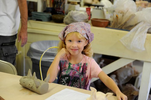
Yesterday Hope finished her Zoo clay class at Crealde. I’ve always enjoyed promoting Hope’s creative side and she’s equally enjoyed taking classes at Crealde the last 1 1/2 years. This is the first class she’s taken in the eight year old and up group and she definitely had fun in her sixth art class she’s […]
by Amanda Kern
no comments
by Amanda Kern
2 comments