“Your identity and your success go hand in hand. Many people sacrifice their identities by not doing what they really want to do. And that’s why they’re not successful.” ~Lila Swell
Many of you were here last fall when I began to establish my business and brand myself. I suppose I’m not the typical photographer. I don’t just love photography…I love design too. And I realized very early on the importance of having my photography represented with a strong brand identity. Some of you may recall me sharing the creative process with you when I worked with Daissy Linares who designed my brand identity. Yes, I admit it was tough stepping down from designing my own brand but I knew that it was more important for me to focus on photography, teaching & my studies at SCAD. And given all that happened in the fall I couldn’t be more proud to have someone as talented as Daissy step up to the challenge of creating an identity to represent me. When I finally made the decision to commit to the logo and brand I now use I recall the big factor in that decision was how much more iconic and memorable the brand was to me. I look back now at the other options I had for logos and I can’t even imagine any of those ideas to have left such an impact with me as my current brand now has.
I know most of you have been anxiously awaiting to hear more about the printing process behind my business cards. Since the fall I had given serious consideration to having my business cards printed letterpress. After doing a lot of research I contacted Nick Sambrato of Mama’s Sauce. He owns the only letterpress shop in Orlando and helped reassure me that all the ideas I hoped to pull off with my business cards were doable and ideal for letterpress. Because I am just such a photography geek and thoroughly enjoy sharing the process behind creative projects Nick agreed to let me, his new paparazzi client, into his shop to document the process to share with you all.
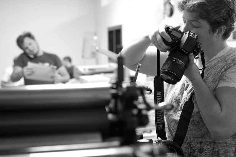
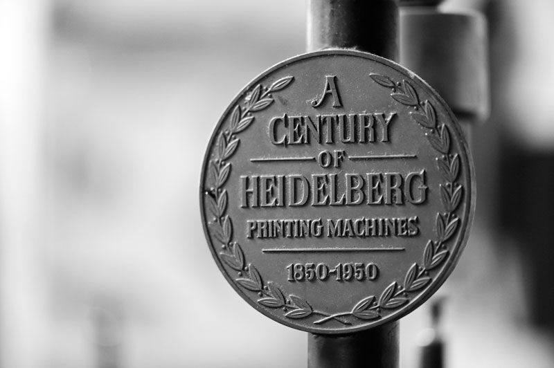
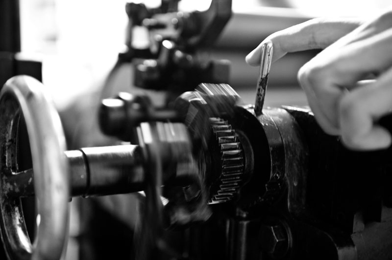
I found myself photographing everything from the details of the press (a.k.a. Vogner…yes, the folks at Mama’s Sauce love their machines so much that they’ve named them!)
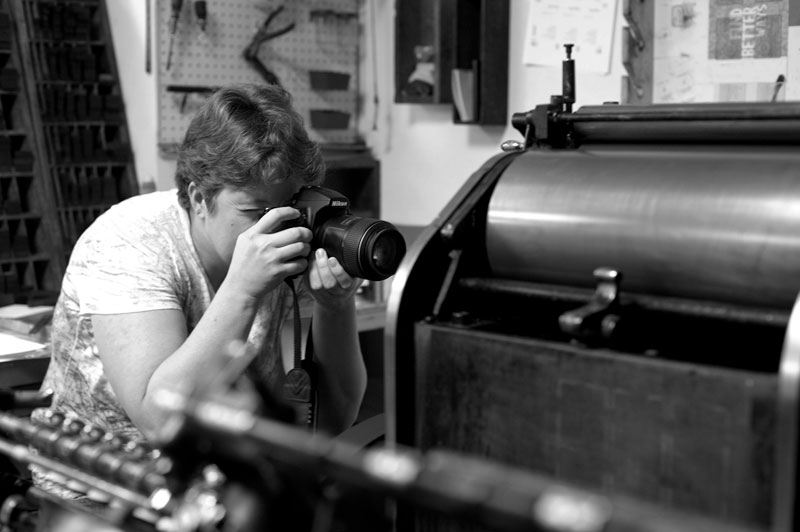
A big thanks to GianCarlo (Blue) Brand who joined me for a bit to help me document some of the printing process. Thanks to him you all are able to see my enjoyment of documenting and seeing the process first hand.
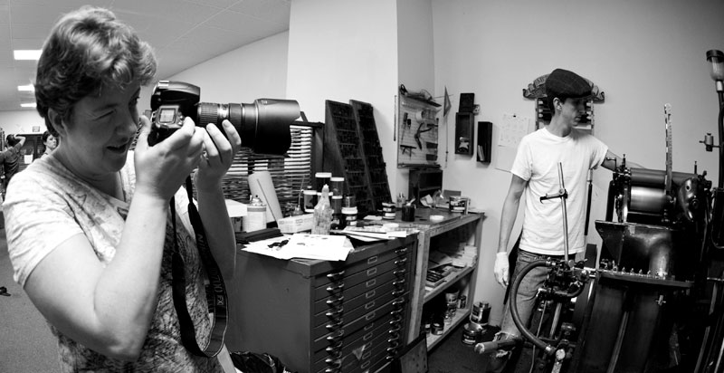
It was exciting to be there seeing the cards get printed. Letterpress printing is a very old form of printing and its very hard to find printers who are able to print letterpress. Yes, it’s a print form that is nearly obsolete in comparison to newer faster and cheaper printing methods like laser printing. But there’s something special about letterpress. You may not get it until you see it for yourself.
Meet Brooks, the letterpress operator who printed my cards. Yes, Brooks is not the stereotypical press operator. He helps bring a youthful and hip fun touch to such an old printing process. After spending time seeing the cards printed first hand I can see why Nick trusts Brooks to take charge of his letterpress. Brooks had amazing attention to detail and spend quite a bit of time checking, double checking and yes, even triple checking colors, registration and impressions. It definitely is a tedious process that only a patient and detail oriented person could take on. For Brooks the printing process is much like an art form and he puts great care into perfecting the jobs he prints. And yes, I suppose I have to share a photo of the guy who printed my cards…he says his Mom will enjoy seeing photos of him hard at work.![]()

I think seeing the cards printed first hand helped me have a greater appreciation for my business cards. Yes, seeing every ounce of color loaded into the press helps me appreciate seeing the color that’s now on my 3 color business cards.
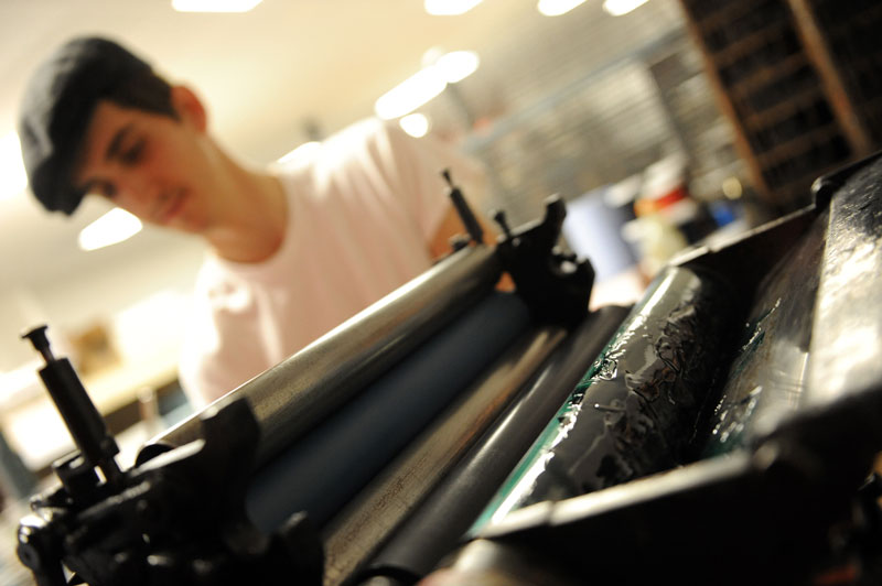
Or watching the speed of the press and all it’s small details…the details that help it pump out some amazing prints.
Throughout the printing process we continually checked color, registration and impressions.
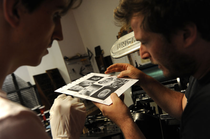
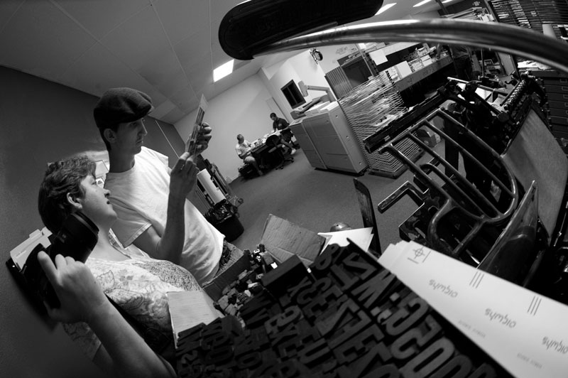
It was rewarding seeing each new color printed and it’s certainly helped me gain a fonder respect for letterpress than I ever had before.
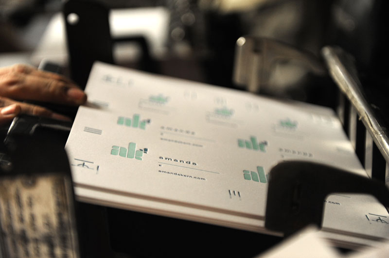
Though I know you all enjoy seeing photos of the printing process I’m sure you’re all interested in seeing the final printed cards. If you’d like to see additional photos of the printing process you’ll find more in my flickr acount.
On to my sweet new cards…
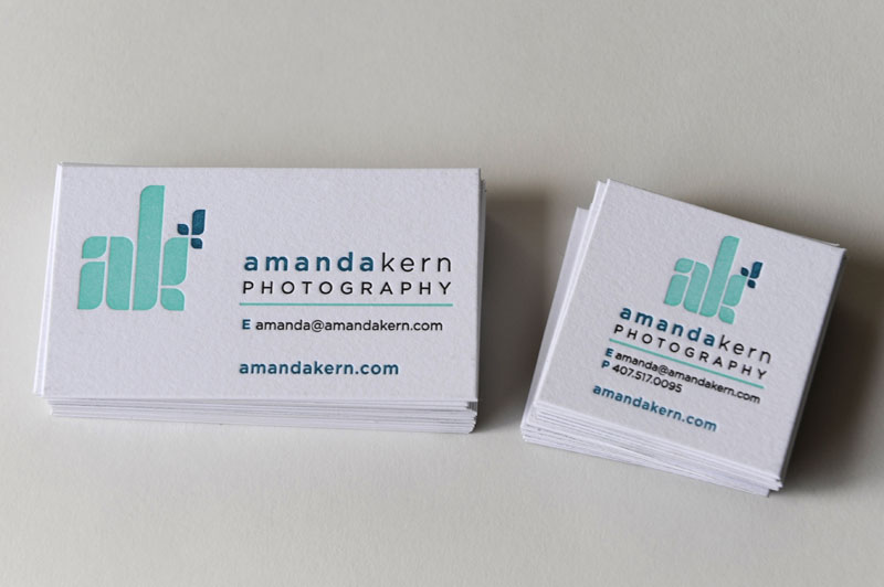
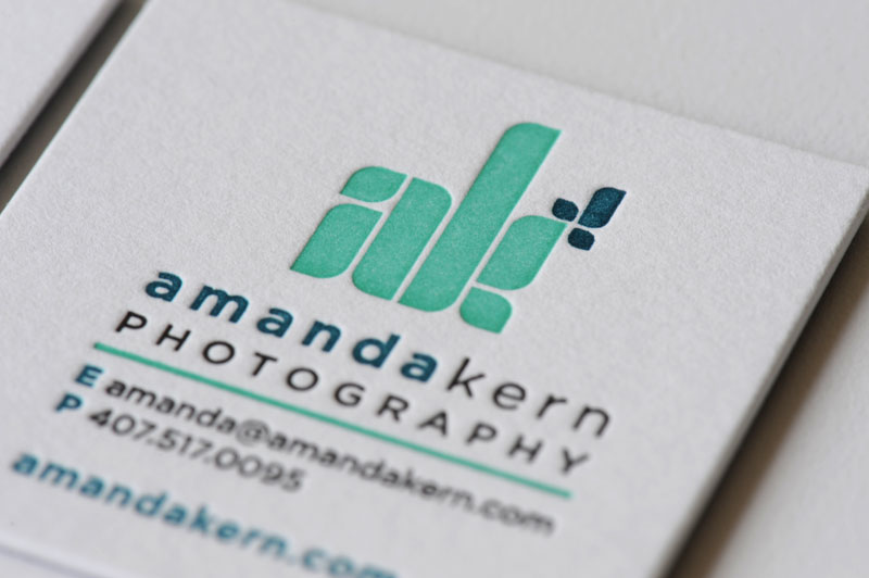
Yes, two versions…one version is standard size and one square size. What makes them extra special is that a different image is on the back of each one.
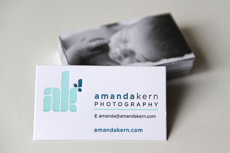
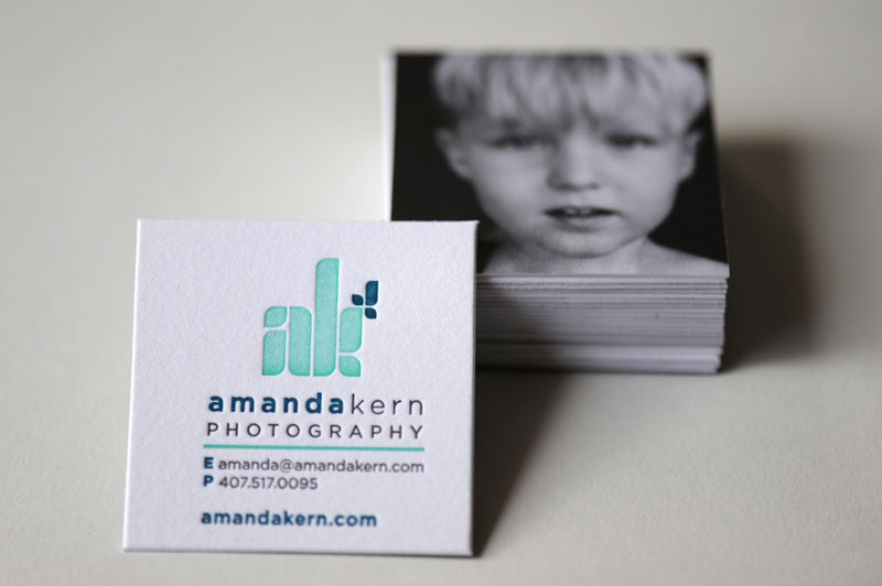
It was extremely tough to decide but I chose what I felt were the most iconic and memorable photos from my portfolio that would fit appropriately in the given space.
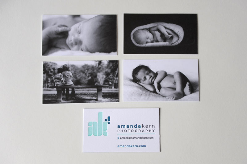
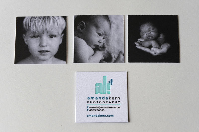
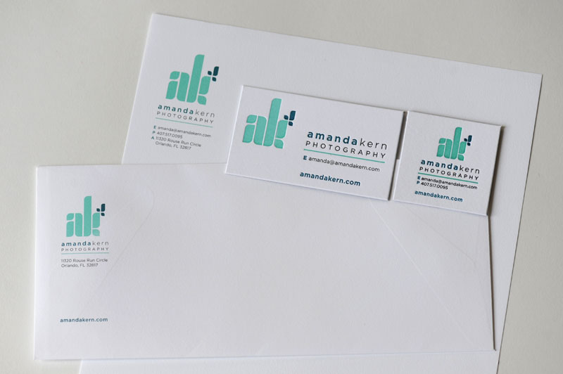
I had Mama’s Sauce print my letterhead and envelope as well but only offset printing for these.
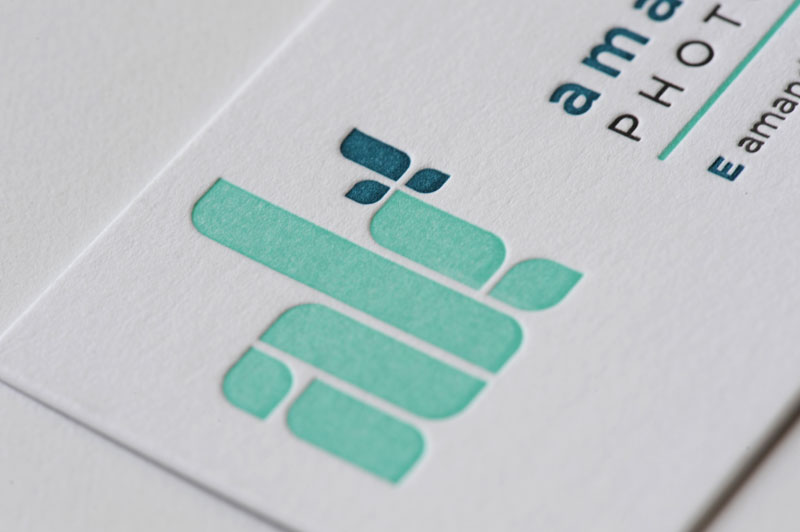
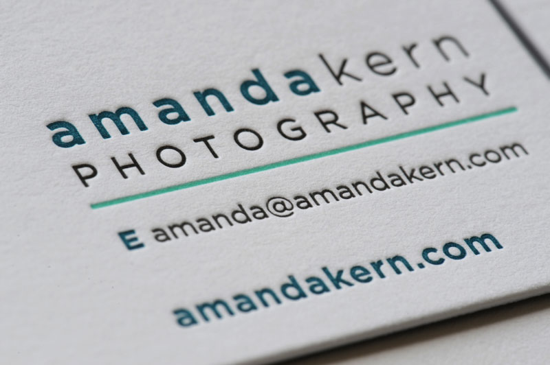
The cards may seem nice from a distance but take a closer look and you’ll notice the detail and impression that makes the impact. These were printed on 220lb Lettraset cotton paper. The images were printed separately and composited/duplexed to ensure the cards were sturdy enough that the impression wouldn’t show through on the back. Yes, my cards are super thick.
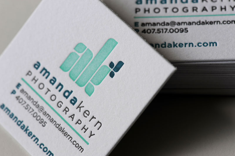
I’ve had quite a few people question my reasoning for printing letterpress. I think just looking at these next few images will be convincing enough to show my reasoning. (Additional photos of my cards can be viewed in flickr)
A FEW QUESTIONS…
Yes, I have had a number of questions before and after having my cards printed so I thought I’d add them to this post to share them with the many out there that I know may be wondering some of these same questions.
Isn’t letterpress a lot more expensive?
Yes.
Isn’t laser or offset printing cheaper?
Yes.
Doesn’t letterpress printing take longer?
Yes.
Why didn’t you take the cheaper and faster route to have your cards printed?
I think it’s important that my brand represent the quality of work I do. Yes, I wanted it to be representative of the timeless images I’ve captured and the tireless energy I put into my photography. I wanted the cards to leave an impact with every person I give a card to…just like the impact I hope my photography leaves with people. I don’t want them to just say “thanks” when I give them a card. I want them to say “wow” or “I love your card”. To me the cards thus far have helped create the attention needed to brand my business and me as a person. They are memorable. They are the type of card that will be kept and remembered.
MY BIG THANKS…
Again, I have to give a big thanks to Daissy Linares for her creative efforts in designing my brand identity. I can’t think of a better designer to work with to design a brand for me…yes, complicated, picky me. Thanks to GianCarlo “Blue” Brand for joining in to help me document the printing process. And a huge thanks to Nick Sambrato and the rest of the gang at Mama’s Sauce. There’s no question…you guys rock.
I hope you all enjoy the cards…I’d love to hear your two cents!


by Amanda Kern
9 comments