I thought I’d share a little good news to start. Some of you may have heard through twitter or facebook, but I know many don’t follow either so I wanted to be sure I updated everyone. Last Friday I receive a call from the doctor and my HCG levels are officially at zero! That’s awesome news. We now wait and pray. It’s likely that I’ll be going back in January for the HSG xray procedure to see if they can confirm whether or not I have the uterus condition they suspected prior to the third surgery.
A SENSE OF PLACE
This is my first quarter working on my masters in Graphic Design at SCAD and I have to say that if it weren’t for how chaotic last month was, I’d have truly enjoyed my classes. I completed my bachelors this past spring, and I must admit that thus far the masters program is pretty exciting with some challenging and enjoyable projects. A lot more emphasis is placed on conceptual ideas and process. I’m still behind after being out for nearly a month due to the miscarriage and all the complications that followed so I will end up receiving incompletes which will give me a little more time to work my heart out on these remaining projects.
I’m closest to finishing my photography course. I just finished another project tonight that I thought I’d share with you all. For every project we receive a project description that lets us know what the theme of the assignment is. For this project it was “A sense of place”:
You will use the photographic medium to express a sense of place for the city in which you live. This assignment is not designed to capture a selection of tourist images of your town or city, but rather should express your own feelings and thoughts about the place. The images do not need to be recognizable as the place where you live. It is more important to provide an emotive experience for the viewer that describes an almost palpable experience of the environment.
For our project we had to create two final digital images – a collage and a montage. I have to admit it’s a term I’ve easily interchanged as a designer and after focusing so heavily on it with this assignment it’s good to finally be able to discern the difference. I imagine other designers still mix up the two terms. For the purposes of the project, we were given a clear description of each:
A collage is composed of portions or fragments of photographs secured from many different sources. Preprinted magazine images might be combined with actual photographs, drawings, prints, photocopies, or even real world objects/textures to create a rich pattern of textures and imagery. The images are usually sourced prior to deciding the conceptual basis of the image and, in turn, should determine the look and concept of the final piece.
A montage is a composite photograph created when two or more separate photographs are combined to create an illusionary or surreal print. A photomontage is distinguished from a photo-collage in that it is a composite printed exclusively from photo images taken by the artist. A montage is usually based around a central idea which is considered prior to sourcing the imagery. A photographer may then go and shoot the required source photographs to create the finished image.
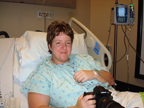 I thought long and hard for weeks before and during the time I was going through all the surgeries and time in the hospital. How could I represent a way to give a sense of place for where I live? And then it dawned on me the weekend I had to return to the hospital to stay the entire weekend. After a fourth trip there – the hospital was almost like a temporary “place” I resided that heavily impacted my life last month. Yes, so much so that during my stay in the hospital I made sure I was armed with my nikon handy every day. I imagine the nurses thought I was crazy to want to take pictures when I really felt so cruddy.
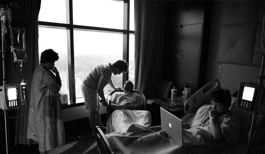
Though I had my camera, and took plenty of photos, I didn’t approach this project until the final day in the hospital. The same day that I got to go home. That morning I was up before sunrise and set up my tripod and took lots of photos using my remote throughout the morning. I was a little annoyed because the light changed so quickly in such a short period of time. It made it tough to control the exposure and it posed problematic a bit when I was montaging. So I just took as many photos as I thought would work for my project and prayed they’d be sufficient, because I had absolutely NO intentions of stepping foot in the hospital again any time soon after that last stay. So here’s the montage of 3 photos that really help give you a glimpse of what it was like in my hospital room…the same “place” that definitely impacted my life.
I was far more excited about the collage portion of the project, because I felt it would allow me to be more creative. I used the outside of the hospital to set the scene. I took the photo the hour before sunset and was disappointed with the sky. I envisioned a darker or more ominous sky. I even went back to reshoot the hospital and a security guard told me I wasn’t allowed to take photos of the hospital. So I had to use what I had already taken. I montaged in the sign on the right, the sky, and then an overlay to create the “rays” and red color. I also used a photo of myself, taken just the day prior to the first surgery. To me it just seems fitting. Seeing it reminds me of why I’m so thankful I am doing the 365 photo project because looking back there’s no way I’d have ever taken that photo (or many others) if it weren’t for my commitment to finish 365. I did lots of scribbling too – including all the type – it was all scribbled with my wacom tablet. Here’s what I came up with for the collage.
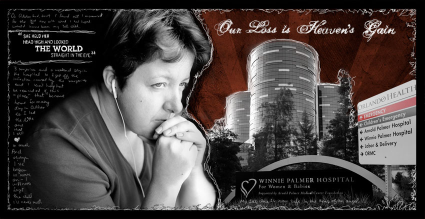
The type on the throughout is ALL rendered by hand using the wacom (except for what is on the signage). Here’s a close up view of the left side in case any of you care to read the words. I have to admit this project was really challenging for me to finish because to be honest, it just brought back so many tough memories.
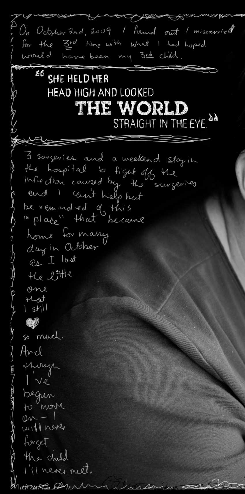
And one of the finishing touches was to add in this little bit of handwriting that is so important for me not to ever forget.

So that’s it…countless hours later…one more project down…tons more to go. I should have a nice stinky fish photo project to share with you all tomorrow!![]()
Hope you all enjoy a glimpse of my crazy busy work at SCAD!



by Amanda Kern
6 comments