Vote on my logo!

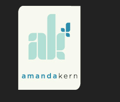
I’m excited to finally share the preliminary concepts for the logo for my photography business. Though I’m also a designer myself, I elected to step back from the design process to give one of my former students, award-winning designer, Daissy Linares, an opportunity to come up with a few concepts that would represent me and my photography moving forward. During the design process we discussed the importance of the versatility of my logo to represent not just my photography, but other endeavors I am equally involved in such as education and design. It’s important to me that my logo not just look “cool” and be very memorable but that it represents who I am as a person and the quality of work that I do.

Though the logos aren’t finalized I feel we’re finally to point that we can share these great ideas to get opinions. I certainly have my own favorites, but I’m interested in what YOU all have to think of the ideas presented. I am presenting black and white versions as well as 2 color versions to help you visualize the versatility of the logo. So take a look and vote for which one you like best! If you want to leave more feedback you can leave a comment for me and I’ll be sure to listen to every single opinion you all have before I make this final decision.

Thanks for your time…and thanks to Daissy for your amazing efforts!

concept1

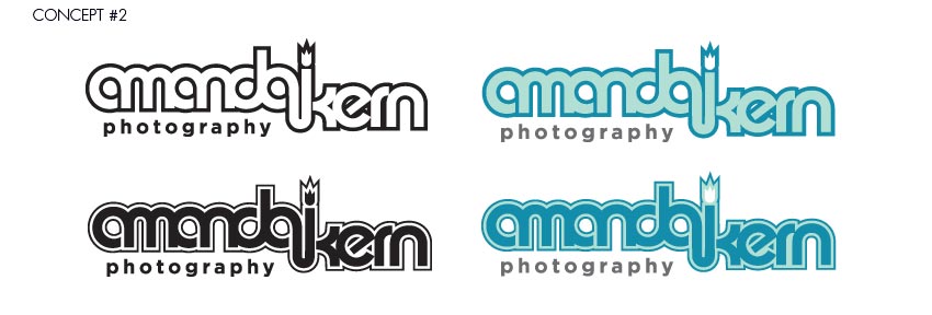
concept2

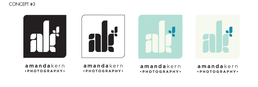
concept3

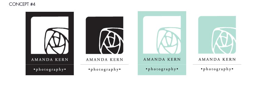
concept4

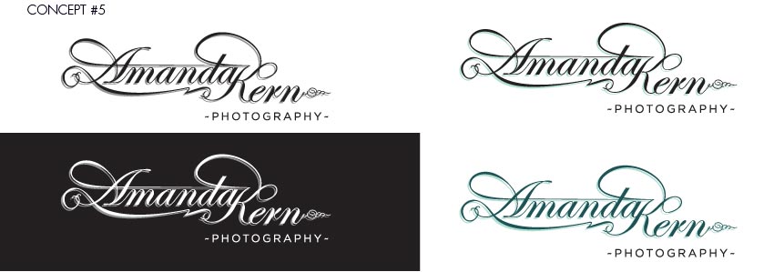
concept5


Share and Enjoy:
  • Print
  • Digg
  • del.icio.us
  • Facebook
  • Google Bookmarks
October 13, 2009 - 6:08 pm

Steve Steger - I like concept #1 for its simplicity and fun nature, however concept #4 feels better with the style of photography you specialize in. Its a bit more mature. Careful with concept #3, its easily mistaken for someone flipping the bird. (No offense duende)

October 13, 2009 - 6:47 pm

Efrain Lugo - Out of the choices 4th looks the most appropriate. Number 1 looks the strongest for a logo overall but it doesnt really speak photography.

Honestly I enjoy the logo you currently have for your header though its a bit played out with the signature mark. It’s classy and speaks photography.

I would enjoy seeing concept 4 further expanded possibly having the logo mark towards the left and the right using ur name and photography. Showing it more of a horizontal fashion would fit best on your website header.

Can’t wait to see the overall outcome :)

Efrain

October 13, 2009 - 7:01 pm

John Sousa - What r you talking about Steve? That would be great if everyone mistook that for flipping the bird, cuz then Amanda can say its playful reference to the old photography term used for getting children to smile in photos: “Smile for the Birdie” :)

Actually, I feel that Steve makes a good point. Concept #1 lends itself too much to one style or age. Be weary of that if you are trying to avoid it. Concept one is very young, and although you shoot a great deal of newborn photography who knows how the logo will interpreted by the parents seeking the photographer.

Concept #5 is very mature and very refined and still very unique, but could be mistaken for a misregistration issue when being printed. But i absolutely love the type treatment. I would buy that t-shirt when it gets printed.

Overall, I like concept #4. It is very iconic, and even very conceptual. The pre bloom flower bud relates to your target subjects. It also feels like the flower is the subject of a photo itself, and its being photographed in the bottom right quadrant of the frame.

That’s just my opinion. Take it with a grain a salt.

October 13, 2009 - 7:19 pm

kristy pennino - that was fun! thanks for letting us vote! :-)

October 13, 2009 - 7:22 pm

Amanda Kern - Steve I bet that #3 might win awards because of what you noticed. :o)
Very interesting vote results thus far.

October 13, 2009 - 7:22 pm

kristy pennino - oh! and sorry amanda i can’t resist: concepts 1 – 3 remind me of the ameriking project we had in advanced 2 years ago.

October 13, 2009 - 7:28 pm

Erica Reynoso - Your name – all by itself- carries so much weight, so much integrity and reputation. I feel like the everything else takes away from that. That’s why I voted Concept #5. Even tho that’s too swirly for my taste. Just sayin’.

October 13, 2009 - 9:03 pm

K. Mascarello-Simari - ohhh looks like i picked the one majority has picked. i really feel like #4 is more amanda’s style. and its got a clean modern feel… and the concept is more suitable for photography. good job though, theyre all great concepts! :)

October 13, 2009 - 9:12 pm

Rosy - I liked #4 I fits your personality better, nice and soft. Like all the baby photos I see you post :)

October 13, 2009 - 9:15 pm

P - #4 for me. Looks enough but not quite like a lens diaphragm. Decisions… decisions

October 13, 2009 - 9:26 pm

Hachem Hosenbux - Hey Amanda. Hope everything is going well with you.

I’m going with #5. I like the simplicity of #1 but there is a bit of awkward negative space in the a, that bugs me a little, #2 leaves me unsure if thats a flame at the terminal of the k or some type of bloom. #3 reminds me of the too prevalent leafy sprouty trend that’s been going around. I think #4 and #5 are both very classic and say photography. The illustration in #4 is very tactile and has a great line quality to it. However #5 wins for me because the typography is beautiful, its got a great flow to it and both clean and sophisticated. A classy logo for a classy lady.

October 13, 2009 - 10:12 pm

Ed Cross - First of all, who is that beautiful baby when you first come to the site? Father must have some rockin guns ;^) Anyway. Good eye Steve (as always). As one who’s been through the Amanda Kern Photography experience, the fifth concept feels right. I think it compliments the style well. When I first saw the edited photos of Abigail, my thoughts were set in the type face used for #5.

October 13, 2009 - 10:15 pm

Ed Cross - Ah! also #4 reminds me of Hallmark.

October 13, 2009 - 10:34 pm

ki.p - woo! concept 4 is in the lead, it’s the one that makes you stop and look, that’s the goal! :D

October 13, 2009 - 10:43 pm

Kenny Roy - Hola! Love them all.. everyone makes good points, but I think has skipped over this statement in your explanation:

“During the design process we discussed the importance of the versatility of my logo to represent not just my photography, but other endeavors I am equally involved in such as education and design.”

1&2 do have a younger edge to them, so in having to vote for only one I skipped them.

4 is very, very nice… but it’s too classy and refined for someone who is working so hard and wants to make their mark. Number 4 speaks ‘photography’ yes… but you may lose the versatility you’re looking for and blend in with the hundreds of other photographers out there.

5 is a close second in my choice and I would love to see it stay as is or be explored a little more. It’s elegant, slightly feminine and has a solid polished feel. This logo would say ‘established professional’ the second it’s implemented.

3 wins my vote for being fresh and refined at the same time. It can be flexible while staying a little edgy. It’s the most transitional to a graphical icon without dropping your initials because the initials are the graphic. It will also double as a great watermark. It makes a great die cut in multiple situations. Both Steve and Hachem’s woes can be avoided with small tweaks. The sans-serif style feels up with the times and we all know how you strive to be current and up-to-date. I could go on, but that’s the just of it. Good Luck!! :D

October 13, 2009 - 10:45 pm

Kenny Roy - ps.. I organized my whole comment into nice clear lines with breaks and once submitted it eliminated all the breaks :(

October 14, 2009 - 1:09 am

Amanda Kern - Sorry Kenny…I sure hope to look into the comment formatting of my blog soon, this blog is still rather “new”. And I am very intrigued by the outcome of this survey. Though I certainly like #4 it definitely was NOT the one I had considered as my top two choices. And Ed, you crack me up…glad to hear that beautiful 9lb baby of yours let you show off those guns!!! :o)

October 14, 2009 - 5:18 am

John Sodaro - Amanda, they are all GREAT!!! I personally like one best because it just looks professional, but I agree that number four fits your personality best!! Love and miss you all even if I am in Korea!!!

October 14, 2009 - 11:42 am

Anabela do Rosario - They all great but I feel that #1 and #2 is a little much to the edgy side and doesn’t necessarily relate to your photography, although it does speak design, not sure what to make out of what is over the k in #2. #3 does have potential, but the type for the initials is little too bold. Although #5 choice of typography is great, sophisticated, I think that this type of logo is very common and somewhat played out.
To help on my decision, I kept in mind about your target audience as well. I know you do a lot of newborn, therefore most people who seek for your photography services would be parents. With that in mind, I chose #4 because I feel that it represents you and your photography best. The classiness and elegance reflects your photography. The clean and solid design reflects your personality and as a designer. I especially like the flower/rose inside the box, because it acts like a photo. It has this delicate yet professional look to it. To me this logo says, professional photographer-designer who is attentive to details captures life’s delicate beauty.

October 14, 2009 - 1:24 pm

Amanda Kern - Number #4 really??? I’m still very surprised by everyone’s opinions.

October 14, 2009 - 3:58 pm

Steve Steger - Concept #4 also slightly resembles an iris of a camera.

October 14, 2009 - 5:05 pm

Bobbie Miltcheva - #4 (among other things) looks like a polaroid with a photo of a wrapped up baby in it. lol!

October 14, 2009 - 5:06 pm

Fio - I love all of them but specially Numero 4 because it represent a more classic and simplistic style just as your photography. I would suggest working a bit more on the word photography and the dots, I’m not really into the dots. But you can probably make them even smaller and separate them a bit more. awesome work!

October 14, 2009 - 5:40 pm

Lorena - Very nice concepts. I’m really going for number 4. It looks like the shutter from a camera, I really like that one :)
Number 4, Number 4, Number 4!!!

October 14, 2009 - 6:27 pm

Amanda Kern - My logo must represent me as a person…not just as a photographer…remember this should represent me as a designer, educator, etc. – not just photography. So as much as I love everyone’s visual cues with #4 relating to photos and babies…that’s not the only thing I do. I’m still very shocked at the results thus far…

October 14, 2009 - 7:52 pm

Paula Angel - I think #5 reflects more what you are, it is clean, slick, detail oriented and sophisticated, also is a reflection of the elegance of your photography. My 2 cents.

October 14, 2009 - 9:03 pm

Connie - Amanda,

I love your blog. As for the designs, I was torn between 1 & 3. I finally chose 1 because it is crisp and clear in presenting you. I thought 3 was a little more feminine but I went with the clarity of 1. I really liked 4 also…and 5. Obviously, you can’t go wrong. They are wonderful designs. Congrats on your new business. Hope you had a nice birthday and anniversary. Much love to you, hon.

Connie

October 15, 2009 - 9:07 am

Julius Maxwell - I’m a little crossed between #1 & 5. I like #1 for the bubbly and fun style, but it doesn’t say photography to me. #5 I like for its simplicity and it’s elegance, but I’m not feeling the drop shadow effect. But with that being said, but feel more complete to me than any of the others

October 21, 2009 - 6:13 pm

Roody Desgrottes - I love the simple design of the first concept, but love concept 4 for the imagery.

Your email is never published or shared. Required fields are marked *

*

*

There was an error submitting your comment. Please try again.

F a c e b o o k   f a n   p a g e
T w i t t e r